Shrinking the Size of Africa: Why Do Maps Lie?
…UN Drops 16th-Century Mercator Map for Equal Earth Design
On Friday, September 4, 2026, the United Nations General Assembly passed a historic, non-binding resolution to officially phase out the traditional 16th-century Mercator projection in favour of a modern, more geographically accurate alternative: the Equal Earth map design.
The “Correct the Map” initiative, spearheaded by Togo and heavily backed by the 55-member African Union (AU), won overwhelming approval with 164 nations voting in favour, six abstaining, and the United States casting the sole opposing vote.
As part of this sweeping decolonial push, Togo aims to completely integrate the Equal Earth map into its national school curriculum by the end of the year.
The Explainer: Why Do Our Maps Lie?
Flattening a three-dimensional sphere (the Earth) onto a two-dimensional sheet of paper is a mathematical impossibility without stretching some part of it.
Cartographers refer to this as a map projection distortion. The map most of the world grew up seeing in classrooms, atlases, and mobile apps is the Mercator projection. Because it was engineered to keep directional bearings accurate for sailing, it stretches landmasses further away from the Equator while compressing regions near it.
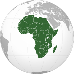
The consequences of this distortion are visually dramatic. For instance, it creates the Greenland vs. Africa illusion. On a standard Mercator map, Greenland and Africa appear roughly equal in size. In reality, Africa is 14 times larger than Greenland.
Experts explained that Africa is vast enough to comfortably swallow the landmasses of the United States, China, India, Japan, Mexico, and most of Europe combined. Yet, the Mercator map shrinks it to look comparable in size to a single European country or a smaller northern landmass.
The Equal Earth map—originally developed in 2018—resolves this by using an equal-area projection. While it slightly alters the shapes of the continents, it ensures that their relative sizes are perfectly proportioned.
Historical Context: “Cartographic Colonialism”
The Mercator projection was created in 1569 by Flemish cartographer Gerardus Mercator. It was designed during the dawn of European maritime imperialism as a highly functional tool for ocean navigation. Sailors could draw a straight line between two points on the map and follow a constant compass bearing.
However, as European powers colonized the globe, the map became an ideological tool. Because the projection heavily inflates the Global North (Europe and North America) while shrinking the Global South (Africa and South America), it visually reinforced narratives of Western dominance.
Critics have long labeled this “cartographic colonialism,” arguing that minimizing a continent’s physical footprint directly alters global psychology, downplaying Africa’s political weight, economic potential, and overall significance.

Editor-in-Chief at Klick News